1) Lisa Oppenheim (at Klosterfelde)

 http://www.contemporaryartdaily.com/2010/09/lisa-oppenheim-at-klosterfelde/#more-17147
The exhibition is called "Blood to Ghosts." The images are pretty over-whelming, but in a strangely simple way. There's something so graceful about them. They're photograms that show a seamless overlapping or progression of the moon's phases from 1851 to the repetition of identical phases in 2010. So, in a way, the images are recycled but simultaneously fresh: the old and the new are adjusted to create the final result, which is an original work.


I love the simplicity of these images. They're so large and powerful but somehow manage to sustain a fragile sensibility. I think a lot of that is caused by the way the perfectly round moon contrasts with the foggy, faded ambiance around it. The moon is so easily recognizable, but when I look at Oppenheim's images it's as though I'm really seeing it for the first time. I have strong emotional reaction to them: a lonely, romantic reminiscence almost.
It's strange for me to be so drawn to such a such a simple image. I'm the type of person to be more interested in pieces with lots of materials, layers, physical depth to the medium. Maybe personal experience with the frustration of making work this way is what makes the idea of such a simple-looking, clean image so appealing. And of course there are the layers of the new photographs atop the old, so there is depth, even if it is not directly visible (I suppose it's more of an imagined depth).
2) Group Show (at UNTITLED)
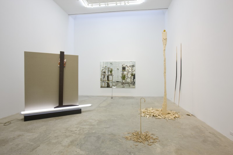
This show contained a multitude of small, three-dimensional installations by David Adams. Again, I am puzzled by the fact that I was once again drawn to very visually simple pieces. Most of the sculptures seemed to be manipulations of found objects, which is a very satisfying idea to me.
Although virtually no information was provided to the viewer in the description of the show as to the intent of each piece, what I take from the set is that these pieces have very specific intentions to the creator, intentions that don't necessarily translate to the viewer. Still, somehow, I'm kind of ok with that. I like the ambiguity of it while still taking from it that sense of specificity to the artist.
The structures, like I said, are simple, but a sense of the complexity of the artists mindset is still present. There's like a bizarre narrative that to the sculptures, like finding a book written in another language: you know there is a story but that doesn't help you read it.
I have a feeling that the structures would have a much larger impact in person, however.

This was a piece I liked in particular. It looks to m like a cane that was gradually widdled away into this thin, fragile form.
My Analysis:
What does it mean that I have (as of late anyway) noticed that I tend to be more drawn toward simple, minimalist art?...I'm not entirely sure.
Part of me feels like my art is getting too congested within itself. I still am very much in favor of layers and texture, but maybe there's away to integrate a material or textural complexity with some kind of the simplicity I'm seeing in these two artists' work. Maybe compositional simplicity?
I think this artist (Maria Chevska) does an effective job of joining compositional simplicity and defined texture in this painting:

You definitely get a sense of depth and I really enjoy the way the layers underneath are peaking through. It looks worked on, yet the simplicity of it makes it seem completely effortless. I like the way those two forces contradict each other. That's definitely something I would be interested in exploring in my work.
1 comment:
Hi Viva - I thnk it's great that you're clarifying a general goal for your blog. Your assessments of work are honest, and I like the statements or metaphors that you make to summarily describe the work: "like finding a book in another language..." for example. Keep it up!
A few artist suggestions:
Kristine Moran
Joseph Cornell
Jonathan Lasker (I'm really curious to see if his work interest you or not)
Ross Bleckner
-Amanda
Post a Comment